Free Engineering Presentation Templates for Students in 2026

- Engineering presentations require specialised templates built for technical diagrams and data-dense layouts.
- Six template types cover every major engineering milestone, from proposals to team collaboration slides.
- A proven 8-slide structure guides audiences from problem statement through to conclusions.
- Overloading slides with text and insufficient rehearsal are the most common student mistakes.
- Free, fully editable engineering templates are available and suitable for professional internship use.
Engineering students face a specific and often underappreciated challenge: their technical work is only as valuable as their ability to explain it.
You can design an optimal structural system, build a working circuit, or model a fluid dynamics problem with precision, but if the slides you use to present that work are cluttered, inconsistent, or visually chaotic, your audience disengages before the key insight lands.
As one engineering educator puts it plainly: “presenting can be the ‘make or break’ for a project. No matter how good your project is, if you can’t describe to people how good your idea is, no one will care.”
This challenge is not a soft-skills problem. It is a structural one. Generic PowerPoint templates are built for marketing decks and business pitches not for communicating flowcharts, system architectures, performance data, or simulation results. Engineering-specific templates give you the right starting structure so you can focus on content rather than fighting the design.
This guide covers why engineering presentations need dedicated templates, how to use them effectively, how to structure your slides from opening to conclusion, the mistakes most students make (and how to avoid them), and where to find the best free options in 2026. Students preparing for high-stakes technical assessments can also benefit from working with an EmSAT tutor to sharpen their technical communication skills.

Why Do Engineering Students Need Specialised Presentation Templates?
Engineering presentations are structurally different from standard academic or business presentations, and generic templates are not built to handle that difference.
A typical engineering presentation involves several elements that standard templates handle poorly: complex data with multiple variables displayed on a single chart, technical diagrams such as flowcharts, system architectures, CAD outputs, and circuit schematics, structured research communication covering literature reviews, problem statements, methodologies, and conclusions, and team-based project slides that need to attribute roles, responsibilities, and timelines clearly.
Research confirms that global connectedness and the digital workplace have reshaped what is expected of engineering graduates. Industries today require engineers with strong oral communication and presentation skills not just technical competence.
An engineering-specific template gives you the scaffolding to meet that standard without spending hours on layout decisions that should have been solved before you started.
The difference matters most at high-stakes moments: your final-year project defence, an internship presentation to industry professionals, a seminar, or a research competition. Generic templates produce slides that look fine at a distance and fall apart under scrutiny. Engineering templates are built with data-dense layouts, technical visual placeholders, and logical flow structures that match how technical arguments are actually made.
Students preparing for chemistry-intensive engineering programmes can also find it useful to work with an AP Chemistry tutor to ensure their technical content is as strong as their presentation structure. Engineering tutors at MEB regularly observe that students who use purpose-built templates spend less time on formatting and more time rehearsing which is the single most consistent predictor of presentation quality.
What Are the Key Benefits of Using Engineering Presentation Templates?
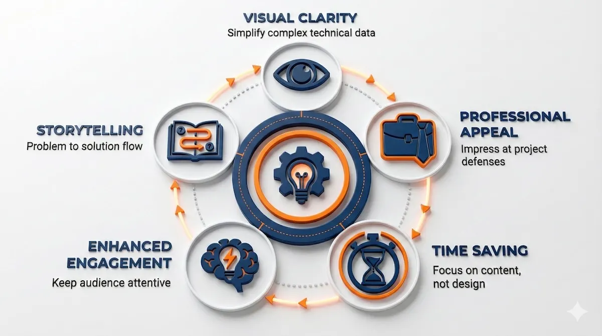
Engineering presentation templates deliver four concrete benefits that compound across your academic career, and each benefit addresses a specific failure mode of student presentations.
Visual Clarity for Complex Data
The primary challenge in engineering communication is translating high-dimensional technical information into something an audience can process in real time. Engineering templates include pre-built chart layouts, data-comparison slides, and technical diagram placeholders so your CAD model, simulation graph, or test result has a visual home that does not compete with surrounding text.
Professional Appearance During Evaluations
Communication skills are pivotal to career advancement for technical professionals. Using a polished, consistent template signals professional readiness in the same way that a well-structured lab report does it tells evaluators, professors, or industry reviewers that you take the communication of your work as seriously as the work itself.
Time Efficiency on Design
Template-based workflows eliminate the most time-consuming, low-value part of presentation preparation: the layout decisions. When slide geometry, font hierarchy, color scheme, and icon style are pre-decided, you spend that time on content refinement and delivery practice the components that actually affect your grade or reception.
Improved Audience Engagement
Well-structured visuals keep professors, peers, and evaluators focused on your argument rather than trying to decode your slide. Every slide should show no more information than necessary to convey its message, and slide titles should stand on their own a standard that engineering templates are specifically designed to support.
Using specialised templates delivers five critical advantages for your academic and professional engineering presentations.
For students who also need to strengthen their quantitative analysis skills, working with an AP Statistics tutor can help with interpreting and presenting data-driven results more confidently.
Top 5 Free Resources to Learn an Easy Coding Language for Engineering Students
What Types of Free Engineering Templates Are Available?
Different engineering milestones require different visual approaches, and understanding which template category fits your context is the first step to choosing well.
Project Proposal Templates
Project proposal templates help you organise problem statements, project objectives, solution approaches, and implementation roadmaps into a logical flow. These work well for final-year projects, capstone presentations, and internship briefings.
Data and Chart Templates
Data and chart templates provide pre-formatted layouts for presenting test results, performance comparisons, and simulation outcomes. The chart areas are sized for legibility under projection, with appropriate axis spacing and annotation placeholders.
Process Flow Templates
Process flow templates are designed for displaying workflows, algorithms, mechanical processes, and system designs. The horizontal and vertical flow structures in these templates handle multi-step processes far more cleanly than ad hoc text boxes.
Research Presentation Templates
Research presentation templates follow a structured academic format literature review, methodology, results, conclusions that mirrors the expectations of professors, thesis panels, and conference audiences. Starting with this structure prevents the common mistake of presenting results before context.
Infographic Templates
Infographic templates convert complex technical information into scannable visual elements. These work particularly well for introductory slides, summary sections, and poster sessions.
Team and Collaboration Templates
Team and collaboration templates are built to showcase group roles, responsibilities, and project timelines the content most students try to squeeze into a plain text slide that ends up unreadable.
Here is a quick reference for which template type fits which engineering milestone.
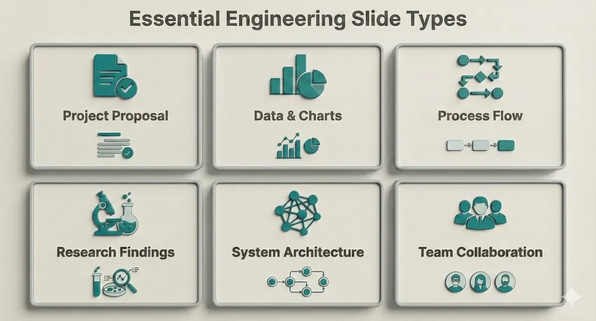
Ensure your presentation covers these six essential slide types common in engineering curricula and internships.
Before downloading any template pack, verify that it includes at least three of the types shown above. A pack that only covers aesthetic styling without these structural categories will not serve a technical presentation.
Students who present psychology or behavioural research components in interdisciplinary engineering projects may also benefit from working with a psychology tutor to frame human-factors content clearly.
Balancing Coding and Language Learning: How to Study French Without Burnout
How to Use These Templates Effectively
A well-chosen template is a starting point, not a finished product. How you use it determines whether your presentation communicates clearly or merely looks professional.
Customise with Your Actual Data
Replace every placeholder with your own research findings, diagrams, or CAD models. A template left with placeholder text is immediately visible to evaluators and signals a rushed preparation. The chart and diagram areas in engineering templates are specifically sized to accommodate technical content use them to carry your core data points, not decorative images.
Are specialised templates actually better than the defaults in PowerPoint or Google Slides? The comparison below shows where the difference is most significant.
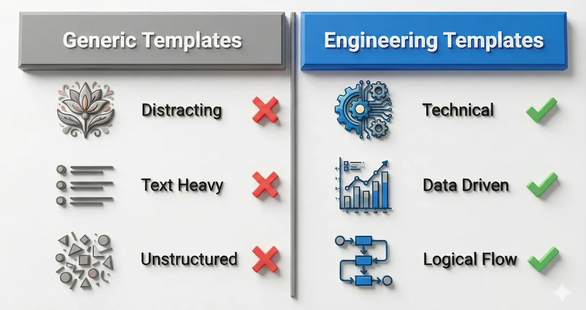
Engineering-focused designs prioritise data and logical flow over decoration — which is exactly what technical evaluators are looking for.
Keep Text Minimal and Purposeful
The best rule of thumb for text is to aim for a maximum of three to four words per bullet point, and no more than three bullets per slide. Your slides are visual aids, not lecture notes. If a sentence needs to be on the slide to make sense, that sentence belongs in your spoken explanation instead. The slide title should convey the conclusion; the visual should provide the evidence.
Use Visuals to Carry the Technical Argument
Add flowcharts, schematics, or images to simplify explanations that would take two minutes to deliver verbally. A well-chosen diagram communicates structural relationships in seconds. The anatomy of an effective engineering slide prioritises the visual element above all else.
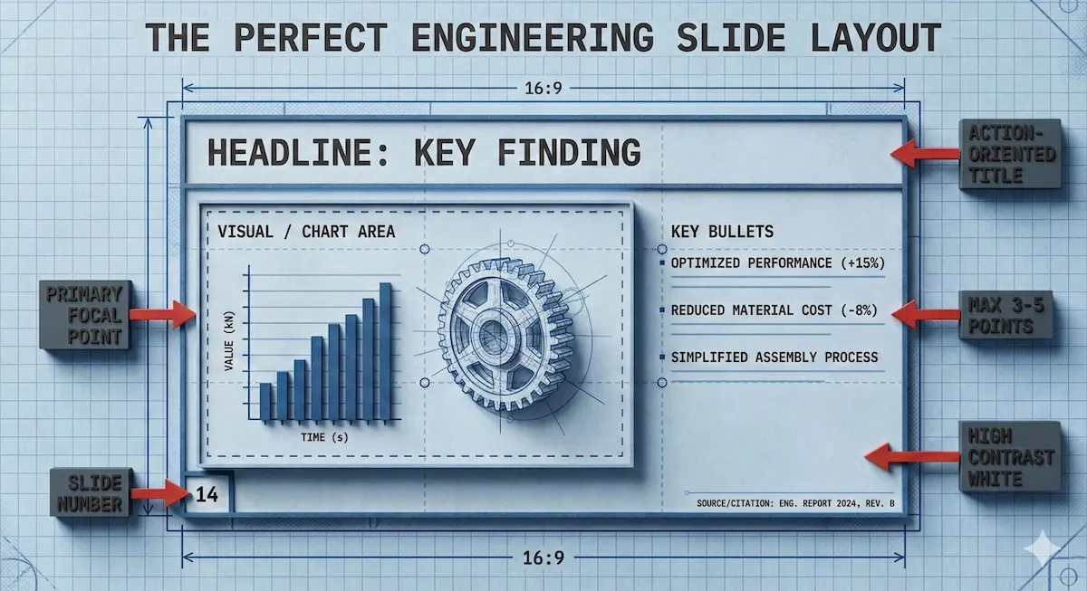
The visual element should occupy the majority of the slide. Text is a supporting element only never the primary content carrier.
Present Your Data as a Story
Even in engineering, the problem-to-solution narrative arc is the most reliable structure for keeping an audience engaged. Your opening frames the problem. Your methodology shows the approach. Your results demonstrate the outcome. Your conclusion states the implication. Every slide contributes to that arc.
The MIT Mechanical Engineering Communication Lab advises that every slide should show something relevant to the motivating problem, and your audience should take away your desired message not a collection of data points without a conclusion.
AI for STEM Learning Using Generative Tools to Make Math and Engineering Concepts Easier
How Should You Structure an Engineering Presentation Slide by Slide?
Knowing which templates to use is one thing. Knowing how to sequence your slides into a coherent argument is what separates presentations that inform from those that persuade. Here is a proven structure applicable to most engineering contexts project defences, research seminars, internship presentations, and capstone reviews.
Slide 1 — Title and Context. Your name, project title, institution, and date. Keep it clean. Do not add a content summary here; that belongs on slide 2.
Slide 2 — Problem Statement. One slide, one problem. Clearly explain the importance of the current project, what the significance will be, and end with a specific, clear, and explicit purpose for the project. If your evaluators do not understand why your project matters by the end of this slide, they will not follow the rest of the presentation as attentively as you need them to.
Slide 3 — Literature Review or Background (if required). Summarise the existing state of knowledge in 3–5 bullet points or a visual timeline. The purpose is to locate your work in context, not to demonstrate how much you have read. Keep this slide brief — academic audiences can and will dismiss a presentation that spends too long on prior art.
Slide 4 — Methodology or Design Approach. Use a process flow template here. Include sample sizes, how data will be processed, everything that was used in the project, and what statistical tests, if any, will be applied. If your methodology is multi-stage, a numbered flow diagram is clearer than a bulleted list.
Slide 5 — Results and Data. This is the most important slide in most engineering presentations and deserves the most space and preparation. Use a data/chart template. Present one finding per slide if your results are complex. Label every axis, define every variable, and state the key takeaway in the slide title not as a caption underneath.
Slide 6 — Analysis and Discussion. Explain what your results mean, not just what they show. Compare against your expected outcomes or against existing benchmarks. This is where your technical judgement is evaluated make it explicit.
Slide 7 — Conclusion and Implications. State your findings plainly in 2–4 bullet points. Then state what they mean for the next step: further research, a design recommendation, an implementation pathway. Evaluators want to know you understand where your work leads.
Slide 8 — Questions and References. End with a clean Q&A slide that includes your contact information and key references. If you end with a question-and-answer session, consider doing your Q&A a few slides before finishing so that you can end strong on your own conclusion ending on an audience question risks ending on a negative note if the last question cannot be answered satisfactorily.
Here is the full workflow from template download to final presentation.
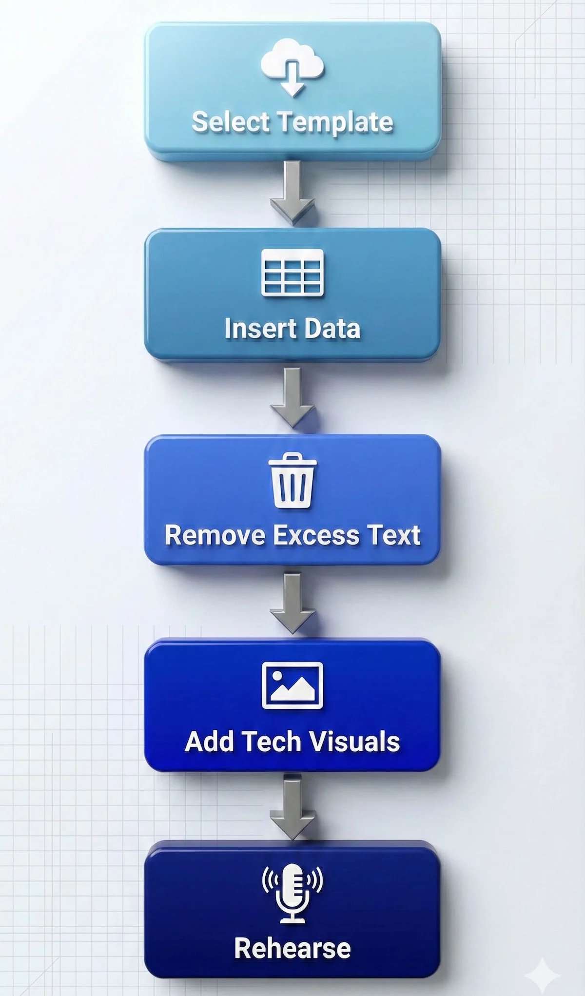
Follow this streamlined workflow to transform a raw template into a defence-ready presentation.
Engineering students who also need to communicate public health or environmental impact data in their projects can benefit from working with a public health tutor to frame those findings accessibly.
Self-Study Engineering: Books That Actually Work
What Are the Most Common Mistakes Engineering Students Make in Presentations?
Understanding what not to do is as important as knowing the right structure. These are the errors that consistently cost students marks, credibility, and audience attention and each one is entirely preventable.
Overloading slides with text. This is the single most common mistake across all student presentations. Students frequently cut and paste whole sentences even whole paragraphs from their documents directly into their slides, producing unreadable content that audiences cannot process while listening. In engineering specifically, this tendency is amplified by the technical density of the content: students feel every detail must be shown. It does not. Your slides visualise your argument; your spoken words carry the detail.
Reading directly from slides. If your audience can read the slide, they do not need you to read it to them. Reading from your slides implies you are not ready to present and the audience will stop listening and start reading instead. Use your slide as a visual anchor for your spoken explanation, not as a script.
Presenting results without context. A data chart shown without an explanation of what the audience should conclude from it is a missed opportunity. Every results slide needs a title that states the finding, not just the topic “Tensile strength increases 23% under treatment B” is more useful than “Test Results.”
Ignoring the audience’s technical level. If your goal is to communicate a new scientific result, focus on results and broader implications rather than methodology unless your audience specifically needs the methodological detail. Calibrate your depth to the evaluators in the room. A panel of industry engineers needs different context than a panel of research academics.
Using inconsistent visual styles. Switching fonts, color palettes, or diagram styles across slides makes a presentation look assembled rather than designed. Make sure main headings are in exactly the same position on every slide, margins are consistent, and colors are applied uniformly throughout inconsistency across slides damages professional credibility even when the technical content is strong. This is precisely the problem that engineering-specific templates solve at the outset.
Insufficient rehearsal. Even expert speakers practice many times before a presentation. Without sufficient rehearsal, you may stumble over words or run over your time limit both of which signal unpreparedness to evaluators. A practical approach: present to a classmate or peer at least twice before the real delivery and ask specifically for feedback on clarity, not just content.
Neglecting the conclusion. Many students spend 90% of their preparation time on the middle slides and produce a conclusion that trails off. Your conclusion is the last thing evaluators hear before they form their final impression state your findings explicitly, state their significance, and finish with confidence.
For a broader look at how tutoring platforms compare in supporting students through technical coursework, see this Elevate K-12 review and this LearnPick tutoring platform review.
Solving Real Engineering Problems with AI Math Solvers
Where Can You Get Free Engineering Presentation Templates?
SlideUpLift offers one of the most comprehensive free and premium collections of PowerPoint templates tailored to engineering and academic contexts. Their free engineering presentation templates are fully editable and compatible with both PowerPoint and Google Slides, which means you can use them regardless of your platform preference.
When evaluating any template source, check for these three qualities before downloading: the template must include chart and diagram placeholders that are appropriately sized for technical content; the color scheme must maintain legibility under both bright and dark room projection conditions; and the layout must follow a logical slide hierarchy rather than a purely decorative one.
Pro tips for using templates in practice:
Know your audience before you customise. Simplify technical depth when presenting to non-specialist evaluators and add mechanism detail when presenting to subject experts. The same data set needs different framing for a panel of industry recruiters versus a panel of research supervisors.
Highlight key insights, not raw data. Your evaluators do not need every data point they need to understand what the data means for your design decision or research conclusion. Use the template’s summary slide layouts to crystallise findings.
Students looking for additional context on how tutoring platforms support academic work can also read this KIS Academics review and this Tutoroo review for comparisons.
Frequently Asked Questions About Engineering Presentation Templates
Do engineering students need a different template for different engineering disciplines?
Not necessarily for the template itself, but engineering students should customise the diagram and chart types to match their discipline’s conventions. Mechanical engineering presentations typically feature CAD outputs and stress-strain graphs; electrical engineering presentations more commonly use circuit diagrams and frequency response plots; civil engineering presentations tend to feature structural schematics and site plans. A general engineering template gives you the right skeleton your discipline-specific visuals are what you add.
How many slides should an engineering presentation have?
A useful guideline is Guy Kawasaki’s 10/20/30 rule: ten slides for a 20-minute presentation with fonts no smaller than 30 points. For a final-year project defence typically running 15–20 minutes, 8–12 slides is a practical target. More slides are appropriate when each slide carries a single data point or diagram the slide count is less important than the discipline of one idea per slide.
Can engineering students use the same template for a live presentation and a submitted report?
No these are fundamentally different documents. A presentation slide deck uses minimal text and relies on your spoken explanation to provide context. A submitted report needs all that context written in because there is no presenter to deliver it. Use the template for your presentation, then create a separate annotated version or written report for submission.
What font size should engineering students use for presentation slides?
A minimum of 24 points for body text and 32–36 points for slide titles. Fonts that are too small to read from the back of the room are among the most common template-related mistakes. If you cannot read your slide comfortably from three metres away from your laptop screen, your audience will not be able to read it when projected.
Is it acceptable to use free templates for professional internship presentations?
Yes, provided the template is fully editable and you have customised it for your specific content. A well-customised free template consistently outperforms a poorly customised premium one. The professional quality comes from how you apply the template specific data, clean diagrams, consistent labelling, and rehearsed delivery not from the cost of the template itself.
How do engineering students make their slides accessible for non-technical evaluators?
Lead each technical section with a plain-English summary of what the slide shows and why it matters before going into the technical detail. Use analogies where relevant comparing a structural load path to water flowing through a pipe, or an electrical resistance network to a road traffic system, gives non-specialist evaluators an access point into the technical content. Engineering tutors can help you work through how to explain your specific technical content to mixed audiences.
Related Reading
******************************
This article provides general educational guidance only. It is NOT official exam policy, professional academic advice, or guaranteed results. Always verify information with your school, official exam boards (College Board, Cambridge, IB), or qualified professionals before making decisions. Read Full Policies & Disclaimer , Contact Us To Report An Error