




~1 min
Average Reply Time
~1 hour
To Be Matched With A Tutor
1 Trial
75% Find Their Tutor On The 1st Trial
$1
Your First 30 Minutes
Hire The Best Responsive Design Tutor
Top Tutors, Top Grades. Without The Stress!


Related Subjects
Your layout breaks at 768px. Your media queries fire in the wrong order. Six weeks to project submission. That is the exact situation a 1:1 Responsive Design tutor online from MEB is built for.
Responsive Design Tutor Online
Responsive Design is a front-end development approach that builds web layouts adapting fluidly across screen sizes using CSS media queries, flexible grids, and relative units — equipping developers to create consistent, accessible user experiences on any device.
MEB offers 1:1 online tutoring and homework help in 2,800+ advanced subjects, including front-end development and its core disciplines. If you have searched for a Responsive Design tutor near me, MEB works across every time zone — US, UK, Canada, Australia, and the Gulf — so location is never the limiting factor. One session can close the gap between a layout that collapses on mobile and one that passes a professional code review.
- 1:1 online sessions tailored to your exact course or project brief
- Expert-verified tutors with hands-on front-end and CSS experience
- Flexible time zones — US, UK, Canada, Australia, Gulf
- Structured learning plan built after a diagnostic session
- Ethical homework and assignment guidance — you understand the code before you submit it
52,000+ students across the US, UK, Canada, Australia, and the Gulf have used MEB since 2008 — including students in Front-End Development subjects like Responsive Design, CSS, and HTML.
Source: My Engineering Buddy, 2008–2025.
How Much Does a Responsive Design Tutor Cost?
Most Responsive Design tutoring sessions run $20–$40/hr. Graduate-level or specialist front-end work can reach $100/hr. Not sure if it is worth it? Start with the $1 trial — 30 minutes of live tutoring or one homework question explained in full — before committing to anything.
| Level / Need | Typical Rate | What’s Included |
|---|---|---|
| Standard (most levels) | $20–$35/hr | 1:1 sessions, homework guidance |
| Advanced / Specialist | $35–$70/hr | Expert tutor, niche depth |
| $1 Trial | $1 flat | 30 min live session or 1 homework question |
Tutor availability tightens around semester project deadlines and bootcamp cohort end-dates. Book early if you are working to a fixed submission window.
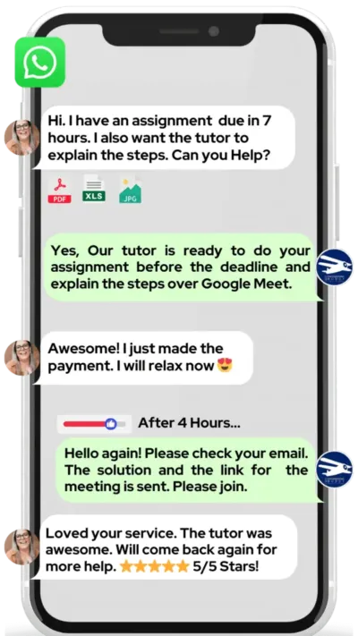
WhatsApp MEB for a quick quote — average response time under 1 minute.
Who This Responsive Design Tutoring Is For
This is not a course for complete beginners who have never opened a code editor. It is for students who have started — and hit a wall. Maybe your grid collapses below 480px. Maybe you understand the concept but cannot make it work in a real project.
- Undergraduate and graduate students in web development, computer science, or UX programmes at universities such as Carnegie Mellon, Georgia Tech, University of Toronto, University of Melbourne, and Imperial College London
- Bootcamp students working through curriculum at Flatiron, General Assembly, or similar programmes
- Students retaking a failed project submission who need to understand where their layout logic broke
- Students with a coursework or project submission deadline approaching — this is the most common reason students contact MEB for Responsive Design help
- Parents supporting a student whose front-end confidence has dropped alongside their project grades
- Self-taught developers preparing a portfolio who want to make sure their work is production-quality before showing it to employers
The $1 trial is a low-risk starting point — you get a real session, not a sales call.
1:1 Tutoring vs Self-Study vs AI vs YouTube vs Online Courses
Self-study works if you are disciplined, but when your flexbox layout misbehaves on Safari, there is no feedback loop. AI tools explain concepts quickly but cannot look at your actual code, spot the cascade error, and correct it live. YouTube covers the basics well — it stops being useful the moment your specific breakpoint logic fails. Online courses move at a fixed pace and cannot pause to fix your project. A 1:1 Responsive Design tutor from MEB works through your actual file, in your actual browser, and corrects errors in the session — not after three forum posts and two days of waiting.
Outcomes: What You’ll Be Able To Do in Responsive Design
After working with an MEB tutor, you will be able to build fluid grid layouts using CSS Grid and Flexbox that hold across mobile, tablet, and desktop breakpoints. You will apply media queries correctly — in the right order, for the right breakpoints — without overriding yourself. You will explain viewport units, relative sizing, and image scaling to a reviewer or examiner. You will present a portfolio project whose layout does not collapse on any device. You will solve cross-browser inconsistencies in Safari, Firefox, and Chrome without guesswork.
Supporting a student through Responsive Design? MEB works directly with parents to set up sessions, track progress, and keep coursework on schedule. WhatsApp MEB — average response time is under a minute, 24/7.
Based on feedback from 40,000+ sessions collected by MEB from 2022 to 2025, 58% of students improved by one full grade after approximately 20 hours of 1:1 tutoring in subjects like Responsive Design. A further 23% achieved at least a half-grade improvement.
Source: MEB session feedback data, 2022–2025.
Students consistently tell us that the moment things click in Responsive Design is when they stop treating media queries as an afterthought and start designing mobile-first from line one. That shift usually happens inside a single session — not after weeks of re-reading documentation.
What We Cover in Responsive Design (Syllabus / Topics)

Track 1: CSS Layout Foundations
- CSS Flexbox — axis alignment, flex-wrap, order, and grow/shrink ratios
- CSS Grid — template columns, rows, auto-placement, and named areas
- Relative units — em, rem, vw, vh, and percentage-based sizing
- The box model — margin collapse, padding behaviour, and box-sizing
- Positioning — static, relative, absolute, fixed, and sticky in context
- Float-based legacy layouts and how to override them in modern projects
Core text: CSS: The Definitive Guide by Eric Meyer and Estelle Weyl covers all layout models in depth and serves as the standard reference for this track.
Track 2: Media Queries and Breakpoint Strategy
- Mobile-first vs desktop-first approach — which to use and when
- Writing media queries with min-width, max-width, and range syntax
- Standard breakpoints for common device categories and when to deviate
- The cascade and specificity — why media queries fire in the wrong order
- Testing layouts in Chrome DevTools responsive mode and real devices
- SASS/SCSS mixins for managing breakpoints at scale
- Container queries — the shift from viewport-based to component-based responsiveness
Recommended reading: Responsive Web Design by Ethan Marcotte (A Book Apart) — the text that defined the discipline and still explains breakpoint logic more clearly than most modern tutorials.
Track 3: Responsive Components and Frameworks
- Bootstrap grid system — columns, offsets, responsive utility classes
- Responsive navigation patterns — hamburger menus, off-canvas drawers, tab bars
- Fluid typography — clamp(), viewport-relative font scaling
- Responsive images — srcset, sizes attribute, and art direction with picture
- Form layouts that reflow correctly across screen widths
- Web accessibility considerations in responsive contexts — touch targets, zoom behaviour
- Performance — lazy loading, critical CSS, and above-the-fold rendering
Supporting text: Every Layout by Andy Bell and Heydon Pickering gives practical component-level responsive patterns that go beyond what most course curricula cover.
A common pattern our tutors observe is that students know what a media query is supposed to do — they just cannot find the rule that is overriding it. Teaching someone to read the cascade from the browser’s perspective, not the editor’s, is usually worth an entire session on its own.
Platforms, Tools and Textbooks We Support
Responsive Design work happens in the browser and the editor. MEB tutors work with you inside VS Code, CodePen, and browser DevTools — whichever environment your course or project uses. Sessions run on Google Meet with a shared screen so the tutor can annotate your code directly.
- VS Code — including Live Server extension and DevTools integration
- CodePen and CodeSandbox — for isolated component debugging
- Chrome DevTools responsive mode and Firefox Responsive Design Mode
- Figma — for translating design mockups into responsive layouts
- Angular and component-based frameworks where responsive CSS intersects with JavaScript
- BrowserStack — for cross-browser and cross-device testing
What a Typical Responsive Design Session Looks Like
The tutor starts by checking where you left off — usually a specific breakpoint that was misbehaving or a grid layout that was collapsing at a certain viewport width. You share your screen and open the file directly. The tutor uses a digital pen-pad to annotate the CSS in real time, walking through the cascade order and identifying which rule is winning at each breakpoint. You replicate the fix yourself — not the tutor. Then you apply the same logic to a second component unprompted, so the tutor can confirm the pattern has transferred. The session closes with a named task: refactor the navigation component to be mobile-first before the next session, using the same media query structure you just practiced.
How MEB Tutors Help You with Responsive Design (The Learning Loop)
Diagnose: In the first session, the tutor identifies whether your problem is conceptual (you don’t understand the cascade) or practical (you understand it but misapply specificity). These need different fixes. Getting this wrong costs weeks.
Explain: The tutor works through a live example — your actual file, not a textbook exercise. Using a digital pen-pad on Google Meet, they annotate the CSS as it renders, showing exactly which rule applies at which viewport width and why.
Practice: You attempt the next component yourself while the tutor watches. This is where most self-study breaks down — there is no one to catch the moment you revert to a bad habit.
Feedback: The tutor corrects step by step, naming exactly which line caused the error and what the browser interpreted instead. Vague feedback does not appear here — “your flex-direction is wrong” is replaced with “at 600px, your row becomes a column because you have not reset flex-direction inside the media query.”
Plan: Each session ends with a specific task and the next topic named. No open-ended “keep practising.” The sequence is mapped to your submission date or course milestone.
Sessions run on Google Meet. The tutor uses a digital pen-pad or iPad with Apple Pencil to annotate your code in real time. Before your first session, share your course brief or project spec and any browser screenshots showing where your layout fails. The first session covers your biggest layout problem and sets a working structure for the rest of your project. Whether you need a quick catch-up before a submission deadline, structured work over four to eight weeks, or ongoing weekly support through a semester, the tutor maps the plan after that first diagnostic.
Start with the $1 trial — 30 minutes of live tutoring that also serves as your first diagnostic.
Try your first session for $1 — 30 minutes of live 1:1 tutoring or one homework question explained in full. No registration. No commitment. WhatsApp MEB now and get matched within the hour.
Tutor Match Criteria (How We Pick Your Tutor)
MEB does not assign the first available tutor. The match is made on four criteria.
Subject depth: The tutor must have worked with CSS layout systems at the level your project or course demands — not just general front-end experience. That includes knowing the difference between a bootcamp portfolio brief and a university module assessment rubric.
Tools: Every Responsive Design tutor uses Google Meet with a digital pen-pad or iPad and Apple Pencil. Screen annotation is not optional — it is how the tutor shows you exactly which rule is firing and why.
Time zone: Matched to your region. US, UK, Gulf, Canada, Australia — a tutor in your window, not one you have to meet at 2am.
Goals: Whether you need a layout that passes a code review, a project that hits a rubric, or a portfolio piece that impresses in a job interview — the tutor is briefed on that before session one.
Unlike platforms where you fill out a form and wait, MEB responds in under a minute, 24/7. Tutor match takes under an hour. The $1 trial means you test before you commit. Everything runs over WhatsApp — no logins, no intake forms.
Pricing Guide
Responsive Design tutoring starts at $20/hr for standard undergraduate and bootcamp-level work. Rates reach $35–$70/hr for advanced topics — container queries, performance-optimised responsive systems, or work tied to a specific framework like Angular or a design system in UX/UI design. Graduate-level or niche professional projects run up to $100/hr.
Rate factors: topic complexity, tutor experience level, your timeline, and session frequency. Tutor availability narrows during peak project submission and bootcamp graduation periods — earlier booking gives you more options.
For students targeting roles at companies with high front-end standards or building a portfolio for a competitive UX programme, tutors with professional front-end or product development backgrounds are available at higher rates — share your specific goal and MEB will match the tier to your ambition.
Start with the $1 trial — 30 minutes, no registration, no commitment. WhatsApp MEB for a quick quote.
FAQ
Is Responsive Design hard to learn?
The concepts are not complex. The difficulty is that small errors — wrong cascade order, missing viewport meta tag, conflicting specificity — break the layout silently. Students who struggle are usually making consistent mistakes that one diagnostic session can identify and fix.
How many sessions will I need?
Most students with a specific project or homework problem see clear improvement in two to four sessions. Students building a full responsive portfolio from scratch typically work across eight to twelve sessions, depending on starting level and how much independent practice happens between sessions.
Can you help with homework and assignments?
Yes. MEB tutoring is guided learning — you understand the code, then submit it yourself. See our Academic Integrity policy and Why MEB page for full details on what we help with and what we don’t.
Will the tutor match my exact syllabus or exam board?
Yes. Before the first session, you share your course brief, module outline, or project spec. The tutor is matched to that specific scope — not a generic web development curriculum. Bootcamp rubrics, university module assessments, and self-directed portfolio projects all handled differently.
What happens in the first session?
The tutor runs a short diagnostic — they ask you to explain your current layout approach, then look at your code. Within the first fifteen minutes, they identify whether your problem is conceptual or a specific implementation error. The rest of the session works on that directly.
Is online tutoring as effective as in-person for Responsive Design?
For a screen-based subject, online is often more effective. The tutor sees exactly what you see — your browser, your DevTools, your file. There is nothing to set up, no whiteboard to squint at. Screen annotation on Google Meet is the natural medium for this work.
Can I get Responsive Design help at midnight or on weekends?
Yes. MEB operates 24/7 across time zones. WhatsApp MEB at any hour — the average response time is under a minute. Tutors in the US, UK, Gulf, and Australia mean someone is available regardless of when your deadline pressure hits.
What if I don’t like my assigned tutor?
WhatsApp MEB and a different tutor is matched — no forms, no delay. The $1 trial exists precisely so you can test the fit before committing to a full schedule. If it is not working after the trial, say so and MEB rematch immediately.
Do you help with CSS frameworks like Bootstrap or Tailwind alongside Responsive Design?
Yes. Many Responsive Design sessions involve Bootstrap tutoring or CSS tutoring alongside core responsive principles. The tutor works in whatever framework your course or project uses — they do not impose a preferred stack.
How do I get started?
WhatsApp MEB — share your course brief, the layout problem you are stuck on, and your deadline. MEB matches you with a verified Responsive Design tutor, usually within an hour. The $1 trial starts with 30 minutes of live tutoring or one question explained in full. Three steps: WhatsApp, matched, start trial.
Should I learn CSS Grid or Flexbox first — and does it matter for Responsive Design?
Both are used in professional Responsive Design work. Flexbox handles one-dimensional layouts — rows or columns. Grid handles two-dimensional layouts. Most real projects use both. A tutor will assess which gap is causing your current layout to fail and work from there — not from a fixed teaching order.
What is the difference between mobile-first and desktop-first responsive design, and which should I use?
Mobile-first writes base styles for small screens and adds complexity upward with min-width queries. Desktop-first does the reverse with max-width. Mobile-first is now standard — it produces leaner CSS and avoids overriding complex desktop styles on small screens. Most current university and bootcamp curricula require mobile-first. Your tutor will confirm what your specific course or rubric expects.
Trust and Quality at My Engineering Buddy
Every MEB tutor goes through subject-specific vetting — not a general aptitude test. For Responsive Design, that means demonstrating working knowledge of CSS layout systems, media query logic, and cross-browser behaviour before they take a session. Tutors complete a live demo evaluation and are reviewed after every session through student feedback. Rated 4.8/5 across 40,000+ verified reviews on Google. Tutors hold degrees in computer science, software engineering, or related disciplines, and many have professional front-end development experience.
MEB tutoring is guided learning — you understand the work, then submit it yourself. For full details on what we help with and what we don’t, read our Academic Integrity policy and Why MEB.
MEB has served 52,000+ students across the US, UK, Canada, Australia, the Gulf, and Europe since 2008 — in 2,800+ subjects. Front-End Development is one of MEB’s strongest subject areas. Students regularly come to MEB needing API integration help, TypeScript tutoring, and GraphQL help alongside their Responsive Design work — and MEB covers the full stack. See our tutoring methodology for how sessions are structured from diagnostic to final review.
MEB has operated since 2008 — 18 years of matching students with verified subject tutors, not algorithms. In front-end subjects, that means tutors who have built real layouts, not just taught from slides. The difference shows in the first session.
Source: My Engineering Buddy, 2008–2025.
At MEB, we’ve found that the fastest progress in Responsive Design comes from students who bring a broken project to the first session — not a list of questions. A real layout problem gives the tutor everything they need to diagnose, teach, and set a clear direction in under 30 minutes.
Explore Related Subjects
Students studying Responsive Design often also need support in:
Next Steps
Before your first session, have ready: your course brief or project spec (or a module outline if this is university coursework), a screenshot or code file showing where your layout is breaking, and your submission or exam date. The tutor handles the rest.
- Share your hardest layout problem and your current deadline
- Share your availability and time zone
- MEB matches you with a verified Responsive Design tutor — usually within an hour
The first session starts with a diagnostic so every minute is spent on what actually matters. Visit www.myengineeringbuddy.com for more on how MEB works.
WhatsApp to get started or email [email protected].
52,000+ Happy Students From Various Universities




Reviewed by Subject Expert
This page has been carefully reviewed and validated by our subject expert to ensure accuracy and relevance.